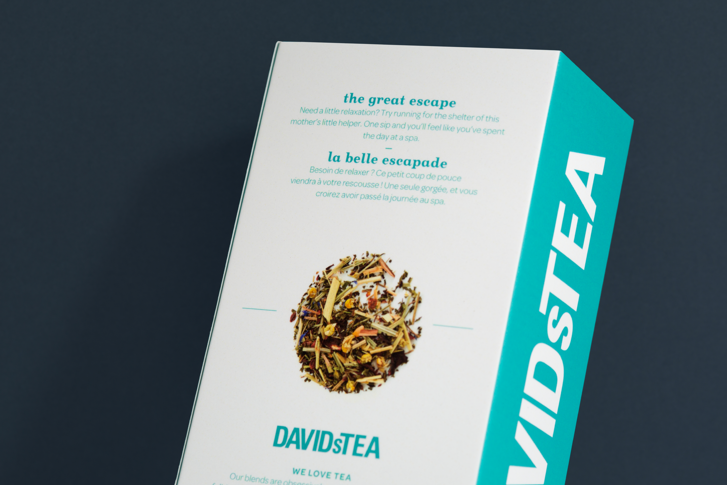
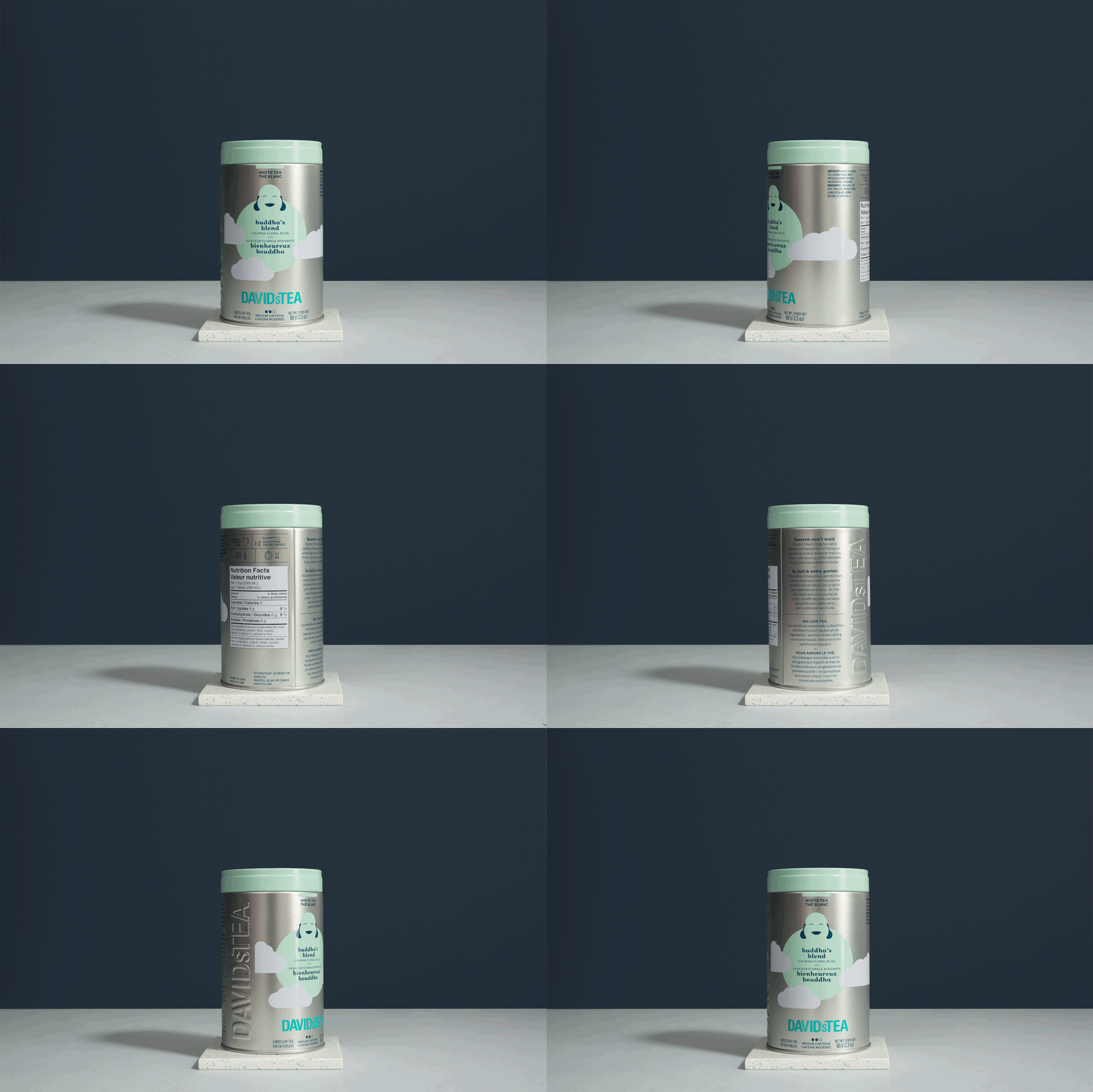
Infusing the magic of a boutique experience into a tiny box of tea.
The Loblaws supermarket chain extended a hand to DAVIDsTEA, offering to market its teas throughout its Canadian distribution networks. In light of this business opportunity, DAVIDsTEA wondered whether it should redesign the packaging of its bestsellers. The answer was yes—all that remained was to decide how to do it. Fully understand the fundamentals of the brand and translate its codes to give it an all-new way to express itself, designed to perform on grocery store shelves. In short, figure out how to fit an entire shop into a tiny box of tea.
-
Client
David’s Tea
Services
Audit and analysis of the competition
Audit and analysis of the current offer
Consumer insight
Brand portfolio architecture
Packaging design
Team
Marie-Ève Caron, planning and brand strategy
Geneviève Grenier, business strategy
Nicolas Boissy, art direction


Strategy
In grocery stores, consumers are in a hurry rather than in an experiential mindset. This new range of packaging would therefore need to successfully convey the experience of a DAVIDsTEA shop, where discovering the product and customer service are the main elements differentiating the brand. Appearance would therefore be key: package design that builds identity, is coherent, and is distinguishing would be a determining factor in the marketing’s success.
Idea
Creation of package designs for 15 of the bestselling teas in a new platform specifically developed for grocery stores. Deployment of 15 unique storytelling scenarios. Choice of illustration as a distinguishing medium to represent customer service. Refined, playful design, which, like the tea shops, democratizes tea and makes information easily accessible.


Results
With this new package design, David’s Tea successfully entered the Canadian market in over 1,800 Category A grocery stores across the country.


