Growing an iconic organic food brand, one joyful bite at a time.
Well-established in Canada but eager to expand, Prana, a Montreal-born organic snack and ingredients company, took on a branding redesign to get ready for their next phase of growth. The objective: Create a brand experience that goes beyond the product, to set Prana apart from a growing competitive landscape flooded with private labels. For Prana, organic is all about being good to people and the planet. We needed to share this value through branding, but also through Prana's greatest communication tool—their packaging.
-
Client
Prana
Services
Audit and analysis of market trends
Audit and analysis of the competition
Consumer insight
Brand positioning
Branding
Packaging design
Product communications
Team
Marie-Ève Caron, brand strategy
Caroline Reumont, art direction
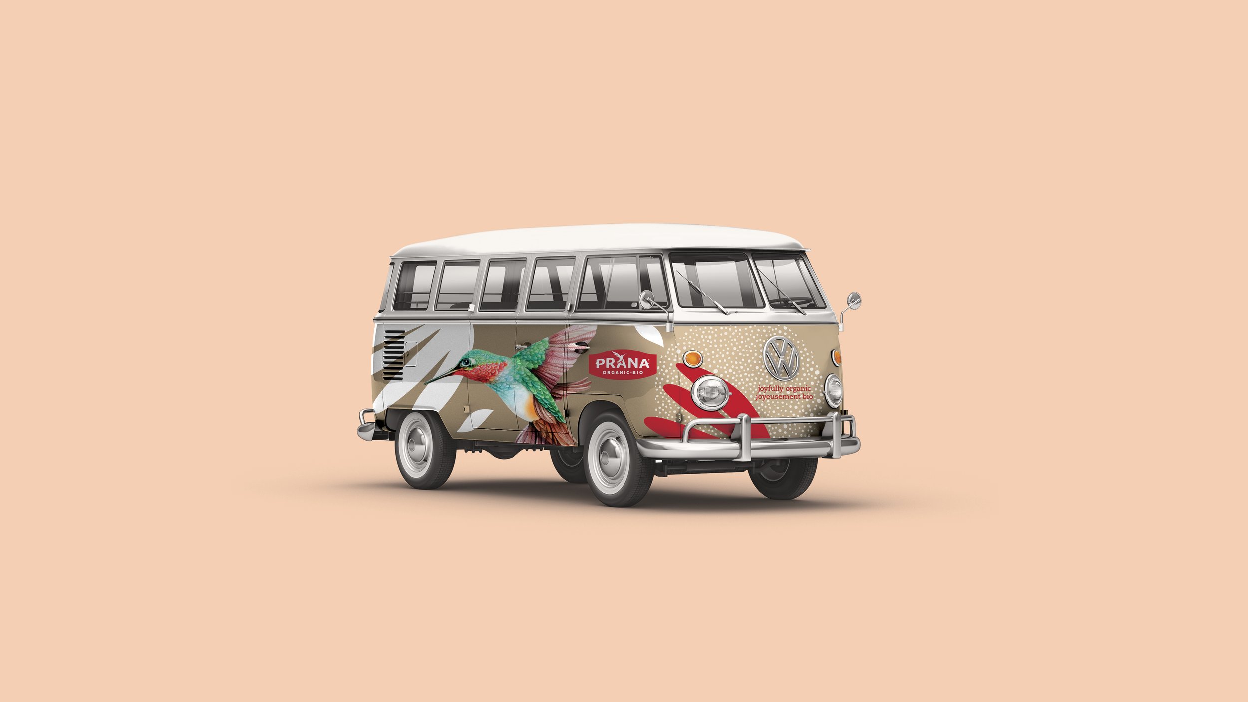
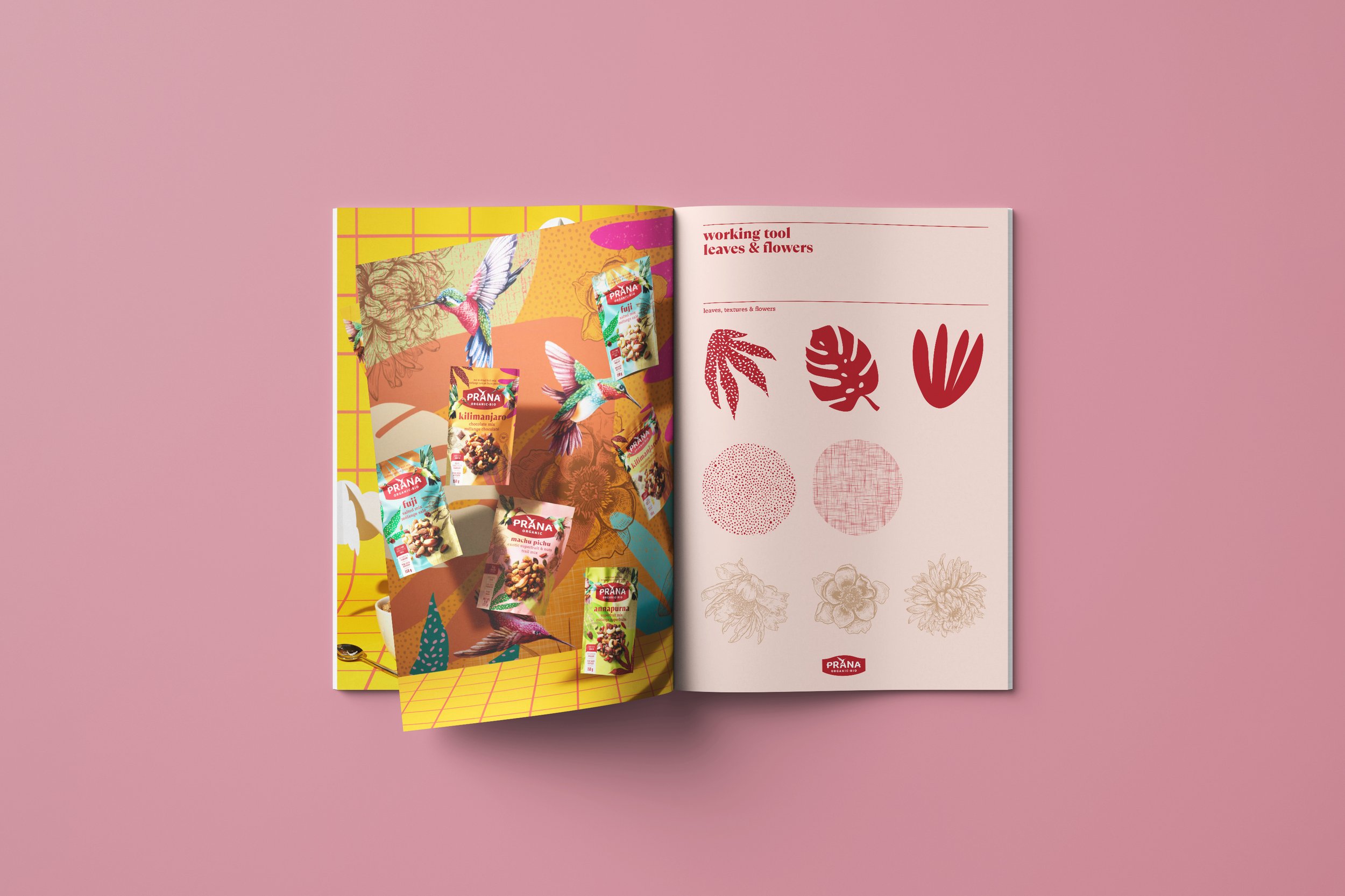
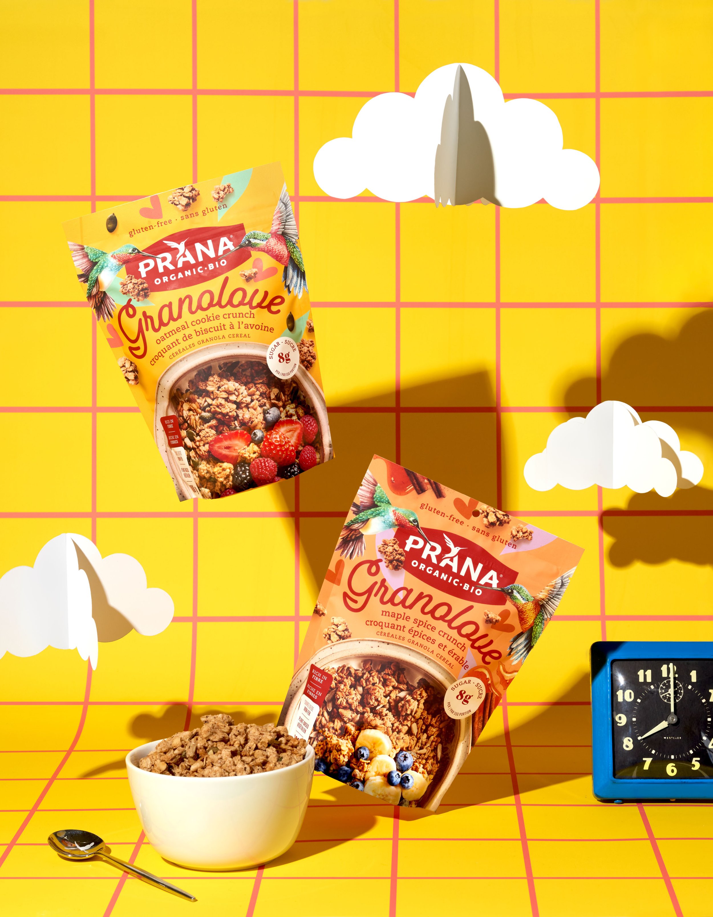
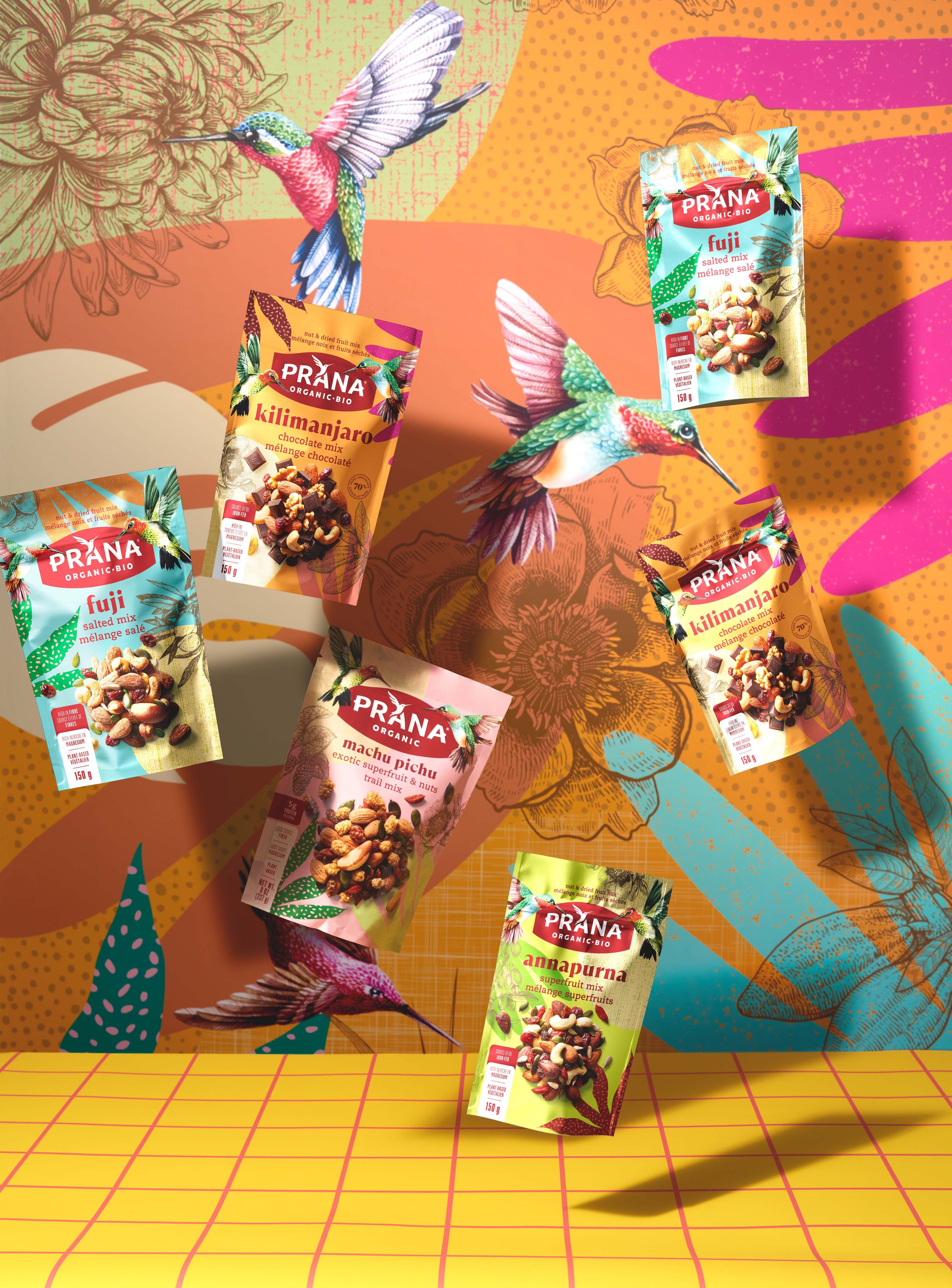
André Dubois, hummingbirds illustrations
Dominique Malaterre, photography
Laure Corten, food stylist
Julie Charlebois, project management
Steve Desmarais, graphic production
François Genois, product ads animation
Absolunet, website
Hans Laurendeau (Shoot Studio), portefolio photography

Strategy
We reviewed analyses, audited the competition, visited stores, conducted work sessions and interviewed key employees. What we discovered: At Prana’s core is a spirit of goodwill that translates into a celebration of food and life. By looking beyond the nutritious benefits of their products, and focusing on the joyful energy that goes into them, we could connect consumers with the joy of eating well and being part of the greater good. Prana’s new positioning champions their positive purpose and meets younger consumers, who are more likely to seek out natural foods, right where their preferences and values intersect.
Idea
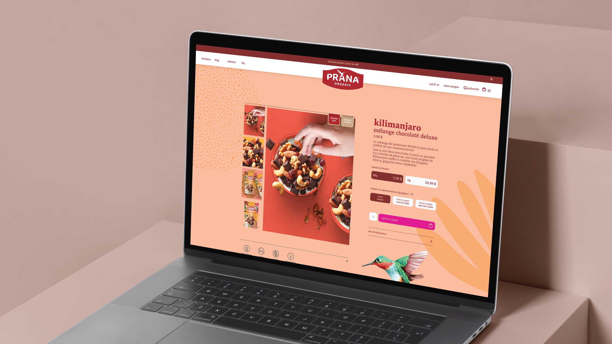
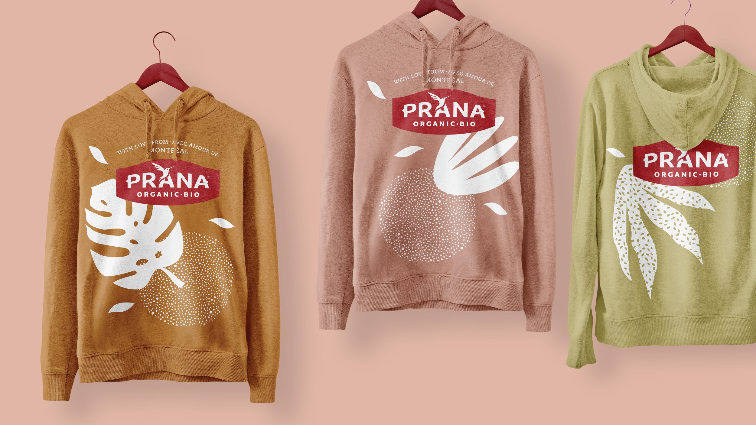
The platform redesign captures Prana's unique joie de vivre with bold colors and lush food photography. Their extensive portfolio of products is now cleanly organized by category, making it easy for consumers to navigate. The hummingbird, already present in the brand's logo, was revitalized to become a central symbol that speaks to the power of small initiatives and the beauty found in strength. By highlighting and reimagining these elements, we strike the perfect balance between Prana’s sustainability mission and impressive taste credentials.

Results
Prana's brand and packaging platform pops in-store and is a clear standout alongside competitor brands. Consumers have shared love for the new look, as have chain buyers.
The response was instantly positive when we presented the new brand to stores. The joyfulness and feel-good vibe shines through. It makes everyone smile and it’s a natural fit for Prana.
— Janick Parent, Vice-President Marketing, Prana